William Morris Collection at Hillarys
In partnership with the V&A Museum
Establishing a cohesive identity for the William Morris capsule collection at Hillarys.
Ensuring the identity celebrates William Morris’ heritage, aligns with Hillarys’ modern and contemporary perception objectives, and complies with V&A licensing regulations.
CONCEPT DEVELOPMENT
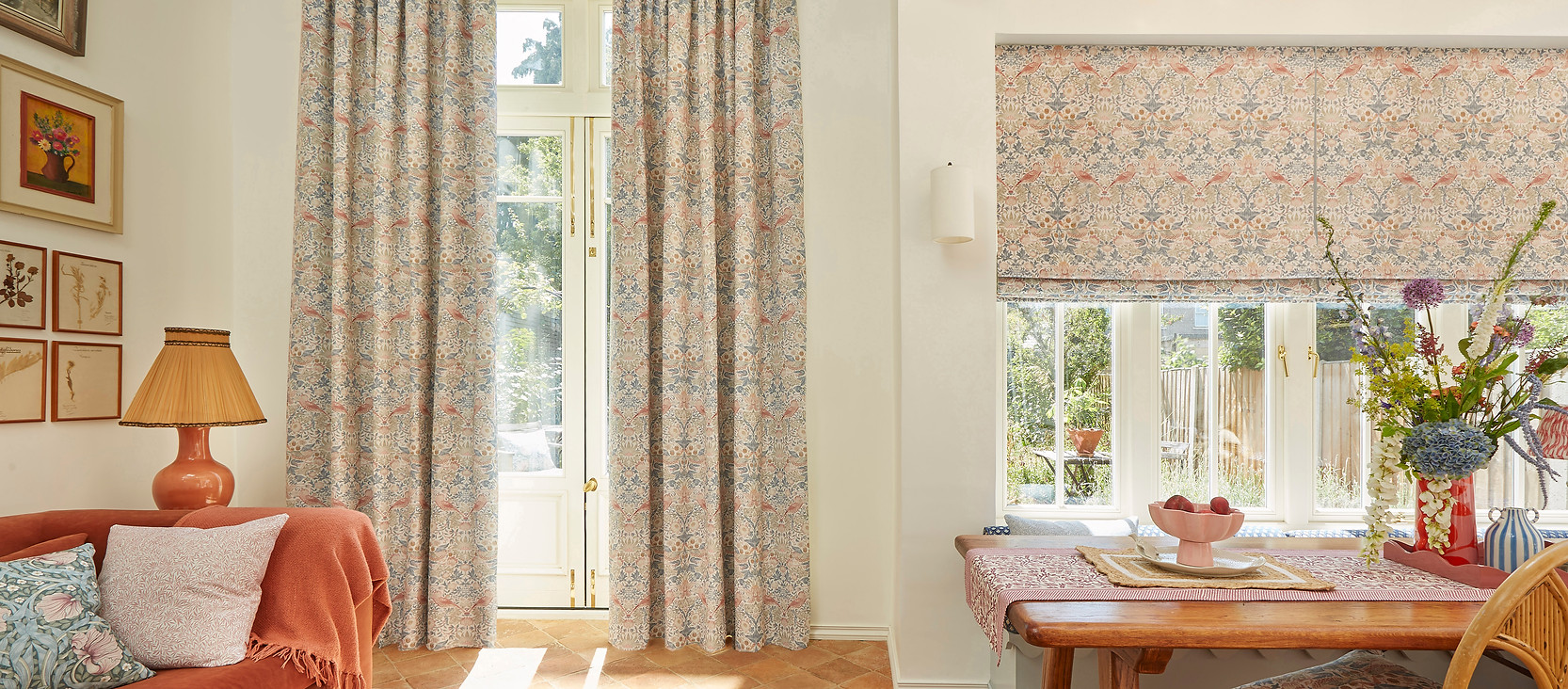
Concept Moodboard


The brief demanded a fine balance between honoring heritage and presenting the collection as both modern and contemporary. My mood-board played a pivotal role in defining this concept from a branding standpoint.
WORKING WITH THE V&A


The collection was licensed by the V&A museum. As part of this partnership we were required to include the V&A logo or partnership message in all communications, which was something that had to be considered in my designs.
The V&A has strict rules regarding the use of its brand.
My concept not only had to meet the expectations of internal stakeholders but also adhere to the V&A’s guidelines.
This added an extra layer of complexity to the brief and presented an exciting challenge throughout the project.
LOCKUP DESIGN DEVELOPMENT
I was briefed by internal stakeholders to develop initial design concepts that presented the collection under a faux William Morris brand. This approach was chosen to strengthen search appeal and customer recognition.

Working to this brief, I created a series of lock-ups that combined serif typefaces for a heritage feel with our Proxima brand typeface for a modern, contemporary layer. I also explored how the partnership might sit within the collection lock-up, although final positioning decisions were made by the Hillarys communications team.
The concepts were well received internally, but when shared with the V&A they clarified that, while they were open to a William Morris led collection name, it needed to be clearly framed as a collection title rather than a brand. They also required the V&A identity and messaging to remain more prominent.
LOCKUP DESIGN

With the V&A's feedback in mind I developed a more subtle collection approach to the lock-up, manipulating the Hillarys' proxima brand typeface with subtle heritage accents.


The partnership strap-line was introduced when the V&A logo could not be used, since their size and usage rules limited placement on some assets.
Where the logo could fit, the strap-line could be removed. I worked with the V&A and the Hillarys communications team to agree when each option applies.
Our communications team also wanted flexibility to reference either the collection name or 'at Hillarys'.
Their initial request was for everything to sit within one lock-up, although this was not workable for all formats, so I created two options.
The examples shown are taken from the brand guidelines. These were detailed instructions I created so that the social and partnership teams could
use the lock-up correctly once the initial rollout was complete.
COLOUR PALETTE
The earthy tones capture Morris’s timeless style, creating a calm and elegant feel. Modern saturation adds freshness.
These colors fit the Hillarys’ identity while standing out as a unique capsule collection.
The Hillarys’ midnight blue brand color underpins the palette.

FRAME DEVICE
I created a framing device to hold the logo or key copy on busy backgrounds. This added some dimension to the concept and helped balance the historical references with a contemporary look.
The frames were influenced by the Arts and Crafts movement and the current trend for classic panelling.


USING QUOTES
I used quotes as flexible graphic elements to add context and authority. I set short quotes and pull-outs in Callie Hand, a handwritten typeface that reflects William Morris’s personal touch and craftsmanship.
Its creative style complements the intricate designs while adding a modern, authentic twist. I used Callie Hand only for short text across multiple touchpoints like brochures, websites, emails, presenter dividers, sample wallet inserts, and PR look books.

SOCIAL POSTS

I designed a series of social assets to promote the collection across meta platforms. Each post balanced strong visual impact with clear messaging.
The strapline didn't need to be used on grid posts as the licencing information would sit in the caption.
SOCIAL STORY TEMPLATES


I created social story templates to ensure consistent branding and flexible content across digital channels, allowing the paid and organic social teams to share updates and campaigns with a cohesive visual style.
PINTEREST PINS TEMPLATES

I designed Pinterest templates that use paired back overlays, since this format performs best on the platform.
WEB ASSETS


Mockups of web assets (assets created in figma) for digital design and web team to work from.
CAPSULE COLLECTION PRESENTER


Divider cards, utilized to introduce each section of the presenter, were employed by William Morris. Given the limited collection size, only 3 were required. Tabbed cards sit at the front of the collection and untabbed within.