Black Friday 2023
Thomas Sanderson
As the designer for the TS Black Friday campaign, I crafted multi-channel visuals that resonated with our target audience and drove engagement across all platforms.
The brief was to deliver captivating designs that protected the brand’s reputation as a premium brand while maximizing the campaign’s impact and ensuring a successful sales season.
CONCEPT DEVELOPMENT
Concept Moodboard

I explored vibrant gradients and optical line distortions that convey energy, movement, and a premium edge for a Black Friday campaign.
Concept Colour Palette

Concept Background

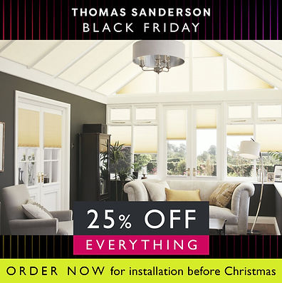
I designed this concept for a premium brand’s Black Friday campaign to create a sense of exclusivity and excitement.
The bold neon palette against a deep black background reflects luxury while signaling urgency and energy, which are key drivers for Black Friday.
The three core colors represent the campaign stages: premium identity, festive Christmas integration, and the hurry period, creating a cohesive yet dynamic visual journey. The vertical gradient lines add depth and movement, giving the design a high-end feel that aligns with the brand’s modern identity and the competitive nature of the event.

CONCEPT DEVELOPMENT
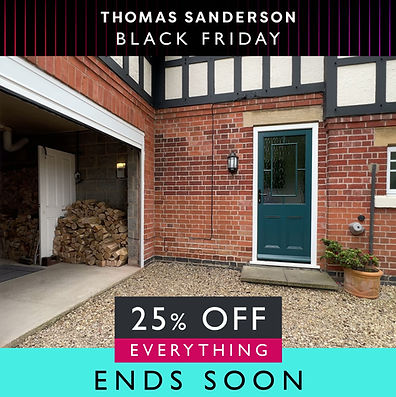
The Black Friday campaign runs in three stages, the core stage, the Christmas-focused messaging, and the hurry period.
The consistent background and typography maintain brand cohesion while allowing each stage to feel unique and purposeful.
Each of the phase colours were pulled from the gradient in the concept background.
WEBSITE HOMEPAGE PROMOTION
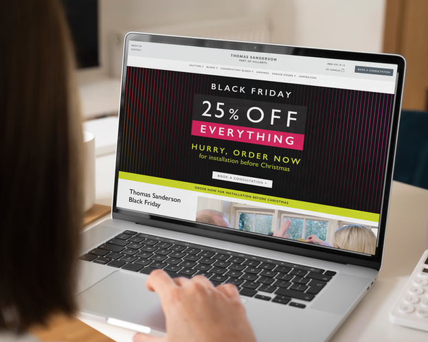

Black Friday is a full takeover on the Thomas Sanderson website. The creative needed to sit within a strict middle safe space (due to the scaling constraints of the site) while staying impactful, communicating all messages and remaining consistent with the campaign.
The Thomas Sanderson customer is an older affluent customer, and the majority of traffic and leads still come through a desktop so creative is centered around these dimensions, with mobile being secondary.
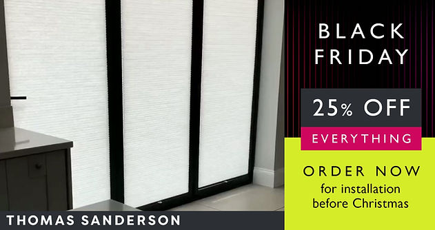
DESKTOP PRODUCT PAGES


The promotional messaging becomes more subtle as you move through the website on desktop.
MOBILE WEB PAGES


Mobile approach to banners, with a full take over on the homepage and more spread out messaging through the site.
The Thomas Sanderson webpage doesn't allow for much flexibility within components and has strict safe spaces, which can be tricky to work with.
STATIC SOCIAL MEDIA OVERLAYS


SOCIAL VIDEO AND PMAX OVERLAYS

SOCIAL STORY OVERLAYS


Accounting for 2023 Instagram safe zones